6/19/2026
Mobile App Development Design That Reduces Rework
Learn how mobile app development design reduces rework with clearer flows, build-ready screens, prototypes, and technical alignment before code.
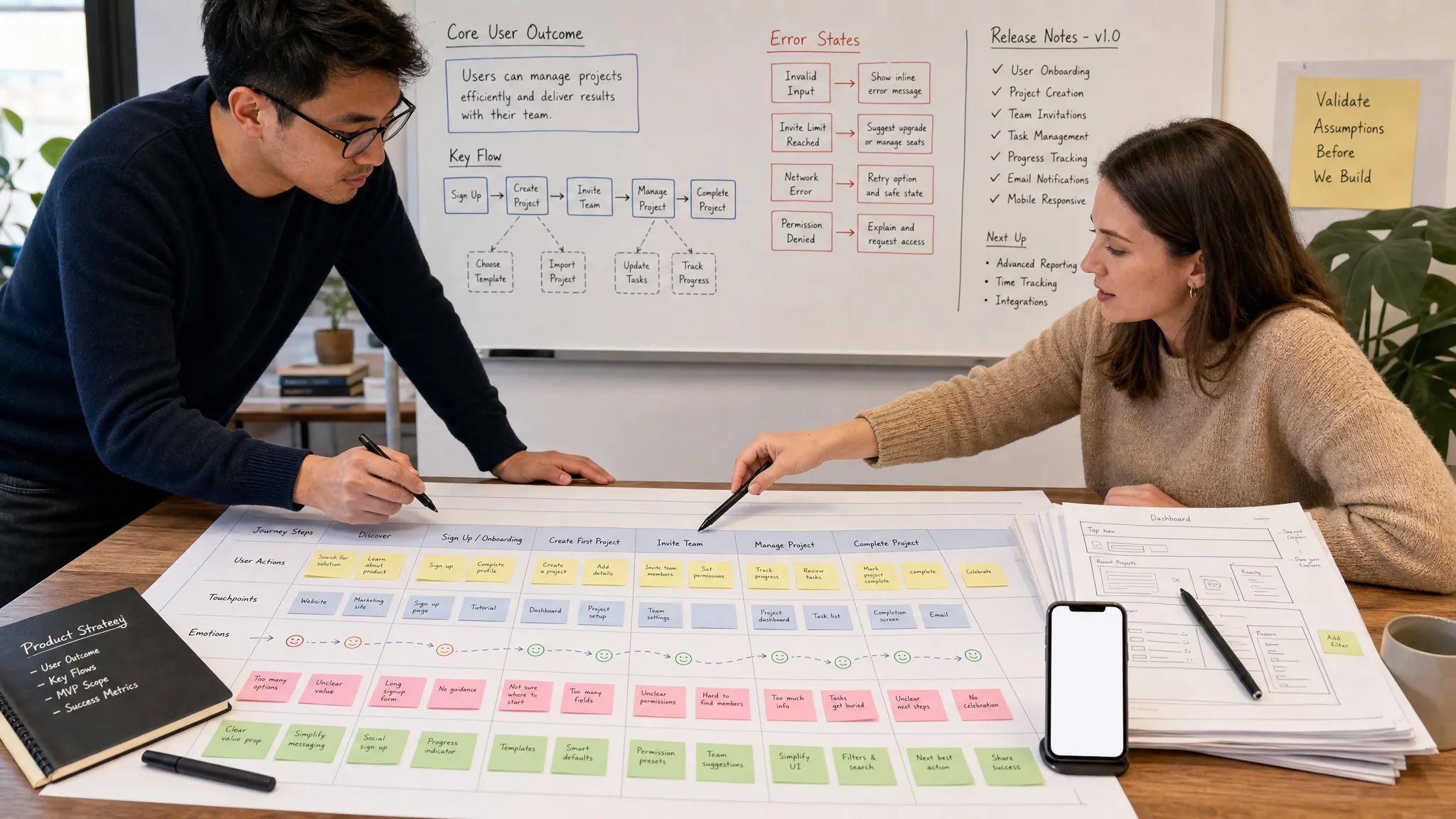
Mobile app development design that reduces rework is not about freezing every idea before engineering starts. It is about removing ambiguity early enough that designers, founders, and developers can make the same product decisions for the same reasons.
For funded startups, rework is especially expensive because it consumes runway twice. First, the team spends time building something. Then it spends more time untangling assumptions, rebuilding flows, retesting releases, and explaining delays to stakeholders. The visible cost is engineering time. The hidden cost is momentum.
The best design process prevents that by turning product intent into build-ready decisions. It clarifies who the app is for, what behavior it should drive, what states each screen must support, and which technical constraints matter before a sprint begins.
This is where mobile app development design becomes strategic. A polished mockup can still create rework if it ignores edge cases, permissions, data latency, app store rules, or platform expectations. A simpler design can save weeks if it makes the right decisions explicit.
What rework reducing design means in mobile app development
Rework reducing design is the discipline of designing the product, the interaction model, and the development requirements together. It sits between product strategy, UX, engineering, QA, and launch planning.
A rework reducing design process answers questions such as:
- What is the core user journey, and what does success look like?
- Which screens are essential for the first release, and which can wait?
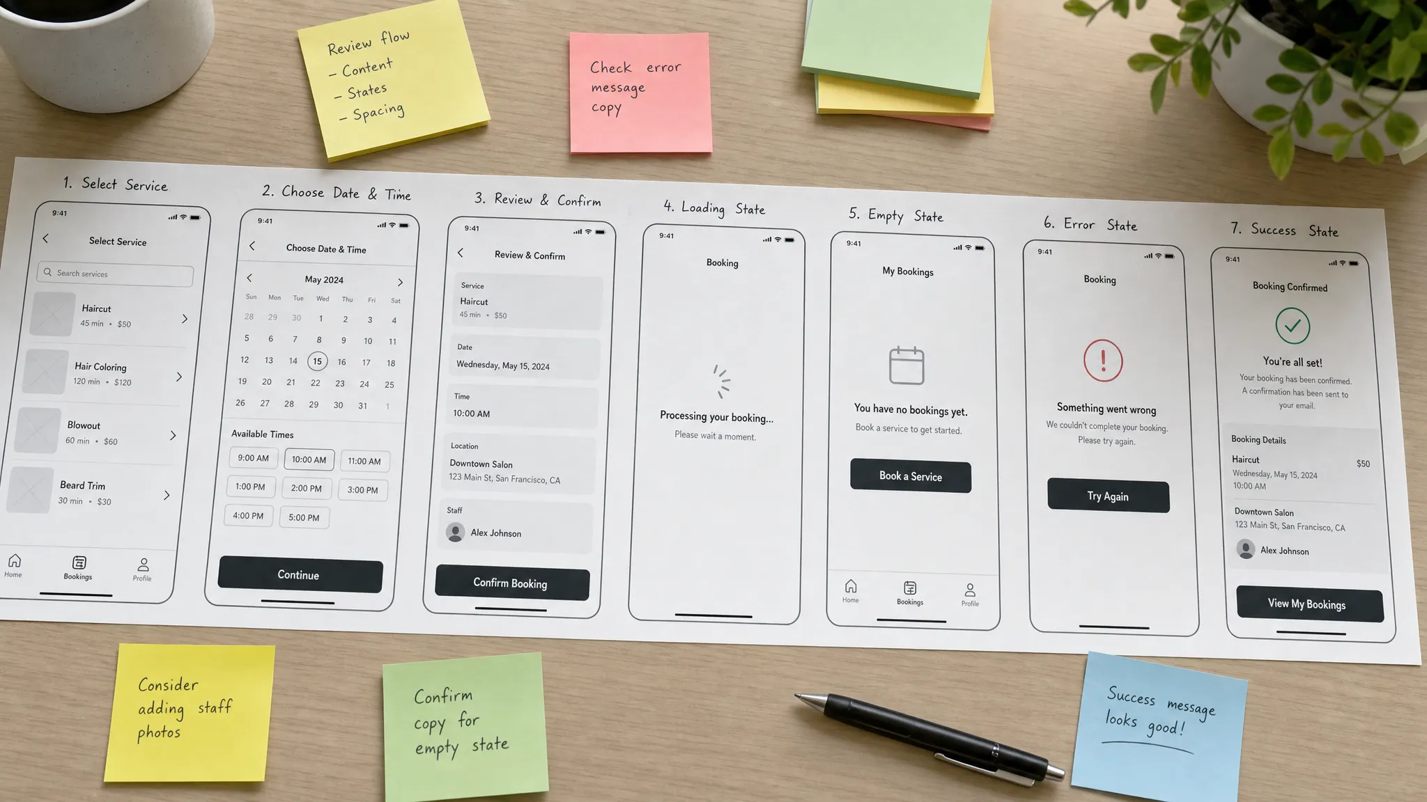
- What happens when data is loading, empty, unavailable, or incorrect?
- What does the app need from the backend, third-party services, and device permissions?
- How will designers and developers confirm that the shipped product matches the intended experience?
This does not mean design needs to become engineering. It means design needs to be specific enough that engineering can estimate, sequence, and build without filling in major product gaps during implementation.
In practice, this approach creates fewer surprise decisions inside sprints. It also makes tradeoffs easier. If a feature does not support the core outcome, it can be simplified or postponed before it becomes partially built code.
Why rework creeps into app projects
Most rework does not come from one bad decision. It usually comes from small unresolved decisions that compound over time.
A founder might approve a screen that looks clean, but the design does not show the failed payment state. A designer might create a beautiful onboarding flow, but it asks for user data before trust has been established. A developer might implement a feature exactly as shown, only for the team to realize later that it requires a backend workflow nobody scoped.
Common causes include:
- Designing isolated screens instead of complete flows
- Treating wireframes as visual sketches rather than product decisions
- Missing states for errors, empty data, loading, offline use, and permissions
- Discovering technical constraints after the UI is approved
- Skipping prototype testing because the team assumes the idea is clear
- Handing off design files without acceptance criteria or behavioral notes
The fix is not heavier documentation for its own sake. The fix is better decision timing. The earlier the team clarifies an assumption, the cheaper it is to change.
Start with the product outcome, not the interface
Before creating screens, define the product promise in plain language. What job will the app help users complete? What moment tells you the app has delivered value? What user behavior matters most for the first version?
For a marketplace, that outcome might be a successful booking. For a wellness app, it might be a completed daily check-in. For a finance app, it might be account setup plus the first tracked transaction. The exact outcome changes by category, but the design discipline stays the same.
A strong outcome statement helps the team avoid feature drift. It also gives designers a way to evaluate every screen. If a screen does not move the user toward the core outcome, it may be unnecessary for version one.
This is why designing before engineering is not just a cosmetic step. It is a product risk reduction step. If you are still shaping your concept, Appzay has a deeper guide on how to design the app before you write code, which pairs well with this rework-focused approach.
A useful early design brief should include the target user, the primary problem, the activation moment, the first version scope, and the known constraints. It should be short enough to guide decisions, but specific enough to prevent endless interpretation.
Map flows before polishing screens
Screen-by-screen design feels productive because it creates visible output quickly. The problem is that users do not experience screens in isolation. They experience sequences.
A user flow shows the path a person takes from intent to completion. It includes decision points, alternative routes, and failure cases. When teams skip this step, they often discover missing screens only after engineering has begun.
For example, a signup flow is rarely just login, account creation, and home screen. It may also need email verification, password reset, social sign-in failure, permission education, profile completion, account already exists, age restrictions, and legal consent. If those states are not designed, they will still need to be built.
Clear flows also reduce debate. Instead of arguing whether a single screen is attractive, the team can ask whether the journey is understandable, complete, and aligned with the outcome. For more detail on this part of the process, read Appzay's guide to designing an app with clear user flows.
In mobile app development, flows should also account for platform behavior. iOS and Android users expect slightly different navigation patterns, permission prompts, and system interactions. A shared product flow can be consistent while still respecting native platform conventions.
Use domain detail to catch hidden requirements
A generic app flow can hide important industry needs. Rework often happens when the team designs a clean journey that does not match how the business actually operates.
For an appointment-based service app, the design may need to support staff selection, treatment duration, consultation notes, deposits, cancellations, repeat bookings, and location-specific availability. A real-world service brand such as Kimistry Hair Boutique shows how premium hair services can involve consultation, personalization, scalp treatments, color services, and multiple decision points before a customer is ready to book.
The lesson is not to copy another business. The lesson is to study the domain deeply enough that the app design reflects real customer behavior. The more specific the workflow, the fewer missing requirements appear during development.
This is especially important for startups building in regulated, operationally complex, or trust-sensitive categories such as healthcare, fintech, education, travel, and on-demand services.
Make screens build-ready, not just beautiful
A high-fidelity design file can look complete while still being incomplete for development. To reduce rework, each important screen should describe behavior, states, content rules, and dependencies.
The best screen designs answer what the user sees, what the user can do, what the system needs, and what happens next. They also show what happens when everything does not go perfectly.
| Design area | Questions the design should answer | Rework it helps prevent |
|---|---|---|
| Loading states | What appears while data is being fetched? | Developers inventing temporary UI or blocking release on missing states |
| Empty states | What does a new user see with no data? | Confusing first sessions and late copy/design revisions |
| Error states | What happens after failed login, payment, upload, or sync? | Unplanned screens and inconsistent recovery paths |
| Permissions | Why should users allow notifications, camera, location, or contacts? | Low opt-in rates and redesigning permission prompts later |
| Offline behavior | Can the user view, save, retry, or recover actions without connection? | Data loss, user frustration, and late QA failures |
| Edge cases | What happens with long names, missing photos, expired sessions, or duplicate actions? | Layout breaks and inconsistent app behavior |
| Analytics events | Which actions need to be measured? | Adding tracking after launch with unclear naming or missing context |
Good design does not need to predict every possible future feature. It does need to define the current feature well enough that engineering can build it without guessing.
Align design with technical decisions early
Design and engineering are often treated as separate phases. That separation creates rework when a design assumes capabilities the technical approach cannot support easily.
For example, a design might show real-time collaboration, offline sync, instant search, or personalized recommendations. Each of those experiences can be valuable, but each has architectural implications. The team needs to decide early whether the first version truly requires them or whether a simpler interaction can deliver enough value.
Technical alignment should happen before sprint commitment, not after the first implementation attempt. Designers do not need to choose the database or write API contracts, but they do need to understand what the app can reliably support in version one.
Important alignment topics include authentication, data ownership, backend workflows, push notifications, payments, analytics, app store policies, device capabilities, and integration dependencies. Appzay covers this engineering side in more depth in its guide to technical mobile decisions that prevent costly rework.
When product, design, and engineering discuss these topics together, the team can choose the simplest design that still achieves the intended user outcome. That is where quality and speed reinforce each other.
Prototype the riskiest moments before building
Not every screen needs a clickable prototype. The risky moments do.
A risky moment is any step where user misunderstanding, technical complexity, or business uncertainty could derail the feature. Examples include onboarding, checkout, plan selection, booking, permission education, account recovery, creator tools, and any workflow with multiple decision branches.
A prototype helps the team test comprehension before committing engineering time. It can reveal whether users understand the value proposition, whether labels make sense, whether the navigation matches expectation, and whether a feature feels too heavy for the problem it solves.
Prototype testing does not need to be slow. Even five to eight conversations with target users can expose repeated points of confusion. The goal is not statistical certainty. The goal is to find obvious friction while change is still cheap.
For startups, prototypes also help with stakeholder alignment. Investors, advisors, early customers, and internal team members can react to an experience instead of abstract requirements. That reduces the chance of late-stage disagreement after development is already underway.
Create a shared definition of done
Rework often appears after a feature is technically complete because the team never agreed on what done means.
A developer may consider the feature done when it matches the main happy path. A designer may consider it done when spacing, typography, and transitions match the file. A founder may consider it done when it supports the business use case. QA may consider it done only when error handling and device coverage pass.
All four perspectives matter. A shared definition of done brings them together before the sprint begins.
For each feature, define the core behavior, required states, supported devices, analytics events, accessibility expectations, and acceptance criteria. Keep this lightweight, but make it explicit. A small amount of clarity here can prevent large amounts of rework later.
A practical acceptance statement might say: users can create a booking, select a date and time, see unavailable slots, receive a confirmation, recover from failed payment, and view the booking in their profile. That is far more useful than simply saying build booking screen.
Design for native expectations
A mobile app is not a responsive website inside a smaller frame. Users bring platform expectations with them.
iOS users expect certain navigation behaviors, permission patterns, gestures, typography, and system components. Android users expect different conventions in areas such as navigation, back behavior, material components, and system surfaces. Ignoring those conventions can make the app feel unfamiliar even if the interface looks modern.
This is where premium mobile app development design requires restraint. Custom UI can be powerful when it supports brand differentiation, but over-customized controls often create engineering overhead and usability issues. Native patterns are usually faster to build, easier to maintain, and more familiar to users.
The best approach is not generic design. It is selective differentiation. Use custom interactions where they strengthen the product's unique value. Use platform conventions where they improve speed, accessibility, and reliability.
Maintain one source of truth for design decisions
Founders, designers, developers, and QA teams often carry different versions of the same product in their heads. That gap becomes rework.
A design decision record can be simple. It should capture the decision, the reason, the tradeoff, and the date. For example, the team may decide to postpone biometric login until after launch because email and social login are sufficient for the first release. That decision prevents the feature from resurfacing in every sprint planning discussion.
The source of truth can live in a product brief, design file, task management tool, or shared documentation system. The tool matters less than the habit. When a decision changes, update the source. When a question repeats, point back to the source. When a new stakeholder joins, onboard them through the source.
This is especially useful when building with a distributed team. Clear decisions reduce meetings, speed up reviews, and keep implementation consistent across iOS, Android, backend, and QA.
Use design QA before release, not after launch
Design QA is the process of comparing the built app to the intended experience before release. It is not about perfectionism. It is about catching mismatches while they are still easy to fix.
Common design QA issues include spacing inconsistencies, missing states, incorrect copy, weak tap targets, broken layout on small devices, strange keyboard behavior, low contrast, awkward animations, and navigation that behaves differently than intended.
Design QA should happen on real devices, not only in simulators or screenshots. Mobile experiences depend on keyboard behavior, gestures, loading speed, haptics, screen sizes, and context. A flow that looks perfect in a design file may feel slow or confusing in the hand.
It also helps to review the product with fresh eyes. Someone who did not work on the feature can often identify unclear labels or unexpected steps faster than the core team.
A practical checklist for reducing rework
Use this checklist before starting development on a major feature. It is intentionally practical, because rework is usually prevented by boring clarity rather than dramatic process changes.
- The feature supports a defined user outcome.
- The full user flow is mapped, including alternate routes.
- Required screens are separated from nice-to-have screens.
- Loading, empty, error, success, permission, and offline states are designed where relevant.
- Content rules are clear, including character length, optional fields, and fallback content.
- Platform differences for iOS and Android are considered.
- Technical dependencies are known before sprint commitment.
- Analytics events and success metrics are defined.
- Acceptance criteria are written in plain language.
- Design QA is planned on real devices before release.
The goal is not to slow the team down. The goal is to avoid accelerating in the wrong direction. A disciplined design process makes development faster because it reduces uncertainty at the point where uncertainty is most expensive.
Frequently Asked Questions
What is mobile app development design? Mobile app development design is the process of shaping the product experience, user flows, interface, states, and handoff requirements so an app can be built effectively for iOS and Android.
How does design reduce rework in app development? Design reduces rework by clarifying user outcomes, mapping complete flows, defining edge cases, aligning with technical constraints, and creating acceptance criteria before engineering begins.
Should startups finish the full design before writing code? Startups should finish enough design to validate the core flow, estimate development realistically, and avoid major ambiguity. Not every future feature needs final design before version one.
What design artifacts help developers most? Developers usually benefit most from clear user flows, annotated wireframes, high-fidelity screens for key states, component rules, API-related notes, and acceptance criteria.
Is a prototype necessary for every mobile app? A prototype is not always necessary for every screen, but it is highly useful for risky moments such as onboarding, booking, checkout, permissions, and complex workflows.
Build with fewer surprises
Reducing rework is not about making a rigid plan. It is about creating enough product, design, and technical clarity that your team can move quickly without rebuilding the same decisions later.
Appzay partners with funded founders to design, build, and launch premium iOS and Android apps end-to-end, from product strategy and UX through engineering, deployment, and support. If you want a technical partner who treats design as the foundation for a scalable product, start with Appzay.