5/16/2026
Design Your App First and Ship Your MVP Weeks Sooner
Design the app first and build your MVP faster. Use user flows, prototypes, mobile constraints, and developer-ready handoff before you code.

Great app development starts before the first repository is created. The most expensive mobile products are rarely expensive because the code was hard. They become expensive because the team began coding before the product was clear.
To design the app before you write code means turning a founder’s vision into decisions developers can build, testers can verify, and users can understand. It is not just making polished screens in Figma. It is defining the user journey, the core loop, the constraints, the data, the trust moments, and the first version that is strong enough to launch.
For funded startups, this pre-code design phase is where speed is created. A tight design process prevents weeks of rework, protects your runway, and gives engineering a clear target instead of a moving one.
What it really means to design the app before development
App design is often misunderstood as visual styling. Visual quality matters, especially for premium mobile products, but it is only one layer. Before code, design should answer one question: what exactly are we building, for whom, and how will it work in real mobile conditions?
A build-ready app design connects product strategy, UX, mobile platform behavior, and technical feasibility. It should expose the hard decisions early, when changes cost hours instead of sprints.
| Pre-code decision | Why it matters | Design artifact |
|---|---|---|
| Target user and painful moment | Prevents generic feature design | User job statement |
| Core product loop | Clarifies why users return | Journey map or loop diagram |
| MVP boundary | Protects timeline and budget | Prioritized V1 scope |
| Screen states | Avoids edge-case rework | Annotated wireframes |
| Mobile constraints | Surfaces platform and permission risks | Technical design notes |
| Launch requirements | Reduces App Store and Play Store surprises | Review and compliance checklist |
When these artifacts are missing, developers have to infer product intent. That usually leads to overbuilding, underbuilding, or rebuilding.
Start with the product promise, not the feature list
Most app ideas begin as a list of features: login, profile, dashboard, search, chat, payments, notifications, AI, maps, analytics. That list may be useful later, but it is a poor starting point for design.
Start with the product promise instead. A strong promise is specific enough that every screen can be judged against it. It should explain the user, the situation, the outcome, and why mobile is the right surface.
A simple format works well:
- For a specific user
- In a specific situation
- The app helps them achieve a specific outcome
- Better than their current workaround
For example, if you were designing a family relocation product, the promise would not simply be to show listings or school data. The real job is to reduce uncertainty before a major life move. Services like relocation planning services show how complex decisions can be packaged around outcomes such as choosing suburbs, securing rentals, and planning school options before arrival. The lesson for app design is clear: design around the user’s real decision, not around the database you happen to have.
Once the promise is clear, scope becomes easier. Features that help users reach the promised outcome belong in the conversation. Features that do not can wait.
If you are still deciding how lean your first version should be, Appzay’s guide to a mobile app MVP is a useful next step.
Define the core loop before designing every screen
A mobile app is not a collection of pages. It is a repeatable loop of motivation, action, feedback, and return. If that loop is weak, polished screens will not save retention.
Before designing the full app, map the smallest complete loop that proves the product has value. This is the path a user should take from opening the app to experiencing a meaningful result.
| App category | First value moment | Repeat loop | Design implication |
|---|---|---|---|
| Marketplace | Find a relevant match | Browse, compare, contact, transact | Search and trust signals matter early |
| Health tracker | Log or measure something useful | Track, review, improve | Input speed and feedback clarity are critical |
| AI assistant | Get a useful answer or output | Ask, refine, save, reuse | Empty states and prompt guidance matter |
| Workflow tool | Complete one task faster | Capture, process, sync, act | Reliability and status visibility matter |
The first session deserves special attention. Users do not owe your app patience. They need to understand what it does, why it matters, and what to do next within seconds.
This does not mean rushing users through onboarding. It means removing everything that delays first value. Account creation, permissions, profile setup, tutorials, and preference screens should only appear when they help the user move forward.
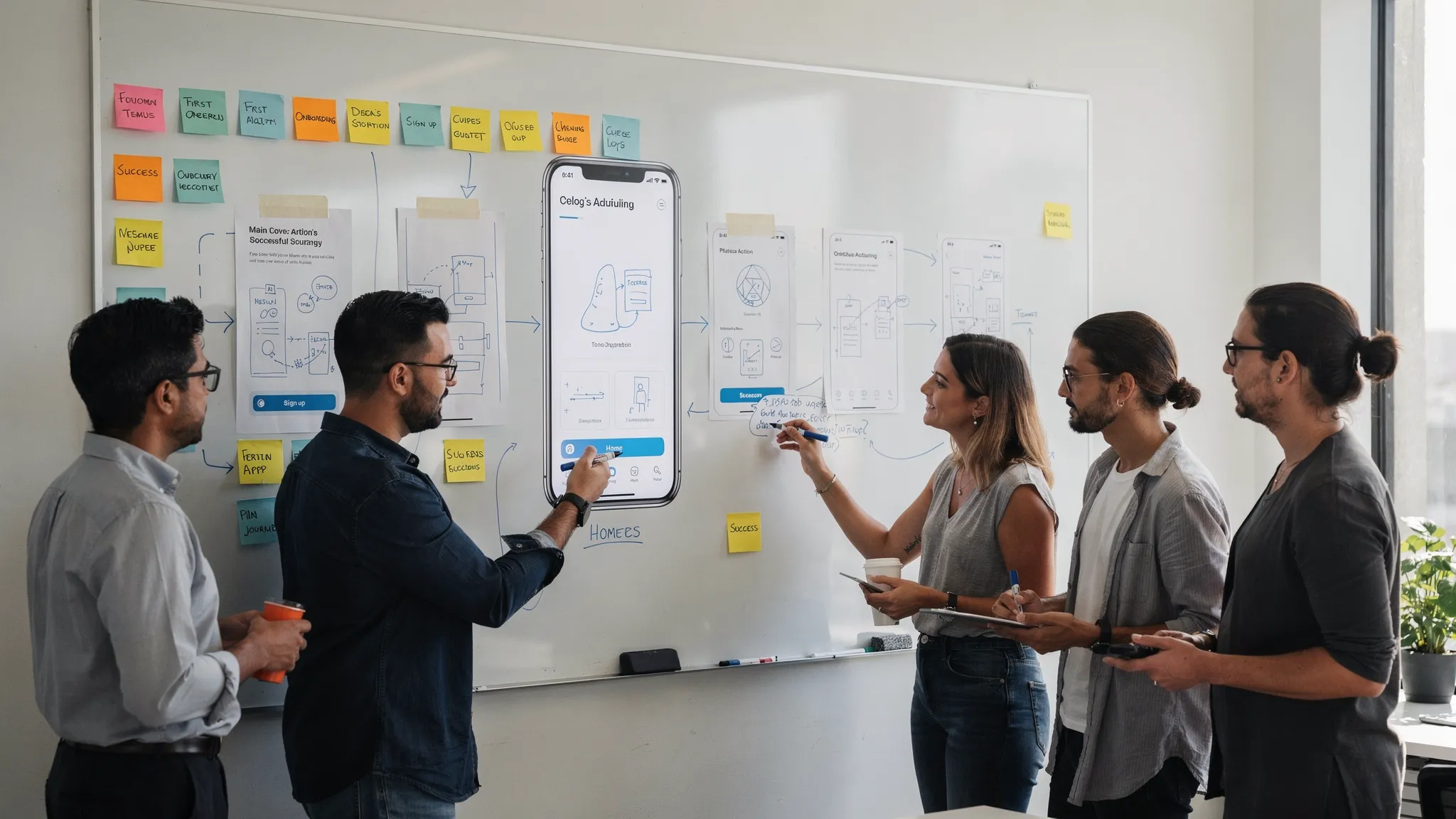
Turn the loop into a screen map
After the core loop is clear, create a screen map. This is a structured inventory of every screen required to support the main journey.
A screen map should include more than the happy path. Real apps have loading states, empty states, permission states, error states, offline states, upgrade states, and account recovery flows. These are often the screens that decide whether the app feels trustworthy.
For each screen, define:
- The user’s goal on that screen
- The primary action
- The secondary action, if any
- Required data
- Possible states
- Validation rules
- Navigation in and out
- Analytics events worth tracking
This is where many teams save weeks. A developer cannot accurately estimate a beautiful dashboard screenshot if nobody has defined where the data comes from, what happens when the data is empty, or what the user can do next.
For a deeper breakdown of screen planning and developer-ready wireframes, see Appzay’s guide to app screens planning.
Wireframe before you polish the interface
Wireframes are not low-quality designs. They are decision tools. Their job is to make structure, hierarchy, and behavior visible without distracting the team with colors, shadows, illustrations, or brand details.
At the wireframe stage, you should be asking practical questions. Does the screen have one obvious primary action? Is the navigation understandable? Are we asking for too much too early? Can the user recover from mistakes? Does this flow still make sense on a small phone?
High-fidelity UI should come after these answers are stable. If you polish too early, stakeholders may debate visual taste while the product logic remains unresolved.
That said, do not stay in rough wireframes forever. Once structure is validated, high-fidelity design becomes important because it reveals spacing, accessibility, platform conventions, brand trust, and perceived quality. The goal is not to avoid polish. The goal is to polish the right thing.
Prototype the riskiest moments
A prototype lets you test decisions before engineering commits to them. It does not need to simulate the entire product. The best prototypes focus on the moments most likely to break user understanding or technical feasibility.
Useful prototype targets include onboarding, first value, search and filtering, checkout, permission requests, AI output review, location-based flows, and any interaction that is unusual for the category.
During prototype testing, watch for patterns rather than isolated opinions. Users may say they like an idea, but hesitation, confusion, and skipped steps tell you more.
Ask simple questions after the test:
- What did the user think the app was for?
- Where did they expect to tap next?
- Which step caused hesitation?
- Did the value feel worth the effort?
- What information did they need but could not find?
A prototype is especially valuable for non-technical founders because it creates something concrete to discuss with engineers, investors, beta users, and potential design partners.
Resolve mobile constraints early
Mobile apps live inside platform rules and real-world device limitations. If these constraints are ignored during design, they return later as delays.
Apple’s Human Interface Guidelines and Google’s Material Design are not just design inspiration. They describe user expectations, navigation patterns, components, and permission behaviors that affect how native iOS and Android apps should feel.
Accessibility also belongs in the design phase. The WCAG 2.2 guidelines provide a useful foundation for contrast, touch targets, text alternatives, input support, and error handling.
| Mobile decision | What to specify before code | Risk if ignored |
|---|---|---|
| Permissions | When and why the app asks | Low opt-in or store review issues |
| Offline behavior | What works without a strong connection | Broken flows in real conditions |
| Notifications | Trigger, timing, frequency, user control | Uninstalls or permission denial |
| Authentication | Sign-up, login, recovery, deletion | Friction and compliance gaps |
| Platform patterns | Native navigation and gestures | App feels awkward or low-quality |
| Performance expectations | Cold start, loading, core screen speed | Poor retention and reviews |
| Privacy disclosures | Data collected and user explanation | App Store and trust problems |
Designing these early does not mean overengineering. It means making intentional choices before implementation locks in assumptions.
Design the system behind the screens
A good app design includes the invisible system behind the interface. Developers need to know not only what a user sees, but what the product believes, stores, calculates, syncs, and sends.
This is where product, design, and engineering should work together. A screen may look simple while hiding complex rules. A booking screen, for example, may depend on availability, payment status, cancellation rules, time zones, push notifications, and admin workflows.
At minimum, define the major objects in the app and how they relate. For a marketplace, that might include users, listings, conversations, bookings, payments, and reviews. For a productivity app, it might include workspaces, tasks, notes, files, collaborators, and activity logs.
You do not need a perfect data model before coding starts. You do need enough clarity to avoid designing screens that cannot be supported cleanly.
This is also the right time to define a lightweight design system. Even a V1 app benefits from reusable buttons, form fields, cards, icons, spacing rules, typography, and error patterns. Consistency helps users learn faster and helps developers build faster.
Create a developer-ready handoff packet
A handoff is not a Figma link dropped into Slack. A developer-ready handoff explains what to build, how it behaves, what is in scope, and how the team will know it is done.
| Handoff item | What it should include |
|---|---|
| Clickable prototype | Main journey and critical branches |
| Annotated screens | Behavior, states, rules, and dependencies |
| Scope definition | V1, later, and explicitly out of scope |
| Acceptance criteria | Testable conditions for each feature |
| Content and copy | Final or clearly marked draft text |
| Analytics plan | Events tied to activation, retention, and conversion |
| Asset package | Icons, illustrations, app icon, splash assets if ready |
| Store readiness notes | Permissions, privacy, account deletion, payment rules |
This packet should be reviewed by engineering before development begins. The review will reveal missing details, unrealistic assumptions, and opportunities to simplify.
For funded startups, this is also where delivery becomes predictable. A clear handoff supports better estimates, cleaner sprint planning, fewer change requests, and faster QA.
Common mistakes when designing an app before code
The most common design mistakes are not artistic. They are decision failures.
- Designing only the happy path and leaving empty, error, loading, and permission states undefined.
- Starting with the home screen instead of the core loop that creates user value.
- Asking for account creation, location, contacts, camera, or notifications before users understand why.
- Treating design and engineering as separate phases with no technical review until implementation.
- Confusing high-fidelity visuals with validated product logic.
- Adding features to satisfy every stakeholder instead of protecting the first version’s main outcome.
- Leaving analytics until after launch, which makes it harder to learn from real users.
The fix is not more documentation for its own sake. The fix is better product decisions captured in a form the team can actually use.
A practical pre-code checklist
Before development starts, you should be able to answer yes to each of these questions.
| Readiness question | Why it matters |
|---|---|
| Is the target user clearly defined? | Prevents vague UX decisions |
| Is the primary outcome clear? | Keeps scope focused |
| Is the core loop mapped? | Supports retention-oriented design |
| Are main screens and states defined? | Reduces rework during development |
| Has the riskiest flow been prototyped? | Catches confusion before code |
| Have platform constraints been reviewed? | Avoids iOS, Android, and store issues |
| Are analytics events planned? | Enables learning after launch |
| Has engineering reviewed the design? | Confirms feasibility and estimates |
| Is V1 scope separated from later scope? | Protects timeline and runway |
| Are acceptance criteria written? | Makes QA and delivery measurable |
If several answers are no, you are not ready for full-scale development. You may be ready for a discovery sprint, prototype, or technical spike, but not for a production build.
Frequently Asked Questions
How much design is needed before coding an app? You need enough design to define the core loop, key screens, main states, technical constraints, and acceptance criteria for the first build. You do not need every future feature designed, but the V1 experience should be clear and testable.
Should we start with wireframes or high-fidelity designs? Start with wireframes to resolve structure and flow, then move into high-fidelity design once the product logic is stable. High-fidelity design is valuable, but it should not be used to hide unclear decisions.
Can developers start while design is still in progress? Yes, but only if the work is intentionally separated. Developers can begin technical spikes, architecture setup, CI/CD, backend foundations, or isolated components while final UX is completed. Avoid starting feature implementation when the related flow is still changing daily.
What is the difference between app design and app architecture? App design defines the user experience, screens, flows, states, and interactions. App architecture defines how the product is built, including data, services, integrations, scalability, and release structure. The best results happen when both are planned together.
How long does it take to design the app before development? For a focused funded MVP, the design phase often takes a few weeks, depending on product complexity, research needs, integrations, and stakeholder alignment. Complex workflows, regulated data, payments, maps, AI, or hardware features usually require more discovery before coding.
Design before you build with Appzay
If you want to design the app before writing code, treat design as a product and engineering blueprint, not a cosmetic step.
Appzay helps funded startups move from concept to launch with product strategy, UX design, native iOS and Android engineering, cloud integration, release orchestration, App Store optimization, and proactive support. The goal is simple: make the right decisions early, build with quality, and launch a mobile product users can trust.
Ready to turn your app idea into a build-ready plan? Talk to Appzay about designing, developing, and launching your mobile app end to end.