4/11/2026
How to Build a Companion App That Users Actually Open
Build a companion app users actually open with a clear core job, fast UX, smart notifications, and the metrics that drive repeat engagement.
A companion app should feel like the fastest way to get value from an existing product, not a smaller, worse version of your main experience. Most companion apps fail because they are built as an afterthought: too many features, unclear purpose, slow to open, and too pushy with notifications.
If you want to build a companion app that users actually open, you need three things working together:
- A clear, repeatable reason to open (a tight product loop)
- A low-friction experience (fast, glanceable, reliable)
- Trust (privacy, control, and notifications that feel helpful)
This guide breaks down how to design and ship a companion app that earns a spot on the home screen.
What “companion app” really means (and why users open them)
A companion app is not defined by industry, it is defined by relationship. It “companions” a primary experience, such as a device, platform, service, event, or real-world behavior.
Users open companion apps for one of four reasons:
- To check status (progress, health, location, inventory, tickets, deliveries)
- To take a quick action (approve, unlock, scan, redeem, message)
- To get timely updates (alerts, reminders, schedule changes)
- To feel connected (community, identity, rewards, fandom)
The strongest companion apps do at least one of those extremely well.
| Companion app archetype | Typical examples | Why users open it | Good “north star” metric |
|---|---|---|---|
| Status dashboard | IoT, logistics, finance, health | Quick check-in | Weekly active users (WAU) with 10-second sessions |
| Remote control | Smart home, cars, cameras, enterprise tools | Do something now | Action completion rate (successful control events) |
| Real-time experience layer | Sports, events, travel | Follow live moments | Live-session retention during events |
| Rewards and habit companion | Safety, fitness, learning | Earn, streak, improve | Repeat sessions per week + streak continuation |
Appzay has built companion-style apps across “real-time experience” and “habit companion” categories, for example the Dallas Mavericks official app (live fan experience) and OnMyWay (behavior, tracking, rewards). The common thread is a tight loop: users know what they will get each time they open.
Step 1: Define the one primary job your companion app will win
Before screens, prototypes, or tech stack, define a single sentence:
“Users open our companion app to ________, because it’s faster or better than any alternative.”
Good companion-app jobs are:
- Immediate: The value is clear within seconds.
- Repeatable: The job happens multiple times per week (or per event).
- Contextual: The app leverages mobile strengths (location, camera, biometrics, push).
A practical way to force clarity is to write your “open trigger” list. These are the real-world moments that should cause an open.
Examples:
- “My order might arrive soon” (status)
- “I’m entering the venue” (tickets)
- “My device is acting up” (diagnostics)
- “I finished a run” (summary)
If you cannot list at least 5 realistic triggers, you may be building a feature, not a companion app.
Step 2: Build the product loop first, then the feature list
Companion apps win by being opened repeatedly, so design around an engagement loop, not a roadmap.
Here is a simple loop that fits most companion apps:
- Trigger: push notification, widget glance, habit moment, live event
- Action: quick check or quick task
- Reward: clarity, progress, confirmation, or delight
- Next trigger: user sets alerts, follows a team, enables reminders
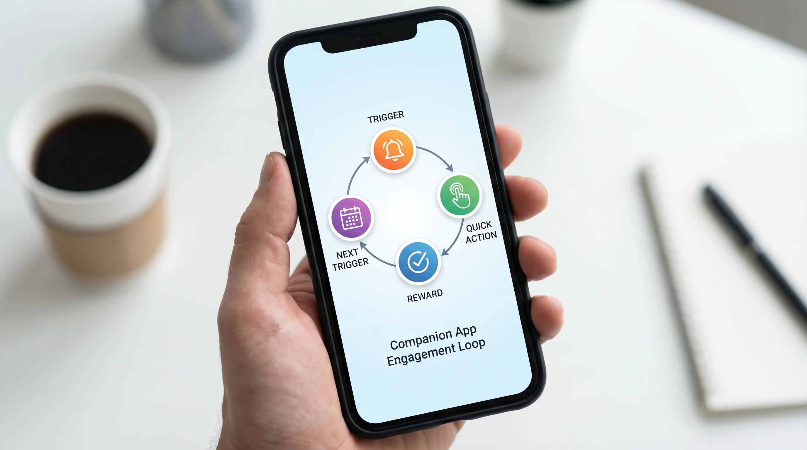
When you build features that do not strengthen one of these steps, you add weight without adding opens.
A useful scoping rule for V1
For a V1 companion app, aim for:
- 1 primary job (the reason to open)
- 1 supporting job (something users do right after)
- 1 trust layer (settings, controls, transparency)
Everything else is backlog until you can prove repeat opens.
Step 3: Design for “10-second value” (glanceability beats depth)
The top UX mistake in companion apps is copying the web dashboard into mobile. Companion apps should be glanceable, with clear hierarchy and minimal navigation.
A good home screen answers, instantly:
- “What’s the current status?”
- “What changed since last time?”
- “What should I do next?”
Tactics that consistently improve open-to-value time:
- Single primary card: one dominant status or live object
- Progressive disclosure: details are one tap away, not crammed upfront (Nielsen Norman Group covers progressive disclosure patterns extensively in UX guidance: NN/g)
- Fast paths: one-tap actions, not multi-step flows
- Deep links: notifications should land on the exact screen that resolves the alert
For platform-specific patterns, keep Apple and Google guidance close:
- Apple design guidance: Human Interface Guidelines
- Android design guidance: Material Design
Step 4: Earn permissions with progressive onboarding (especially for companion apps)
Many companion apps need sensitive permissions (location, Bluetooth, motion, notifications). Asking too much too early is a common reason users bounce.
Best practice is progressive permissioning:
- Show value first with a “preview mode” when possible.
- Ask for the permission at the moment it becomes obviously useful.
- Explain the benefit in plain language, then let the system prompt appear.
Example: If background location enables automatic trip detection, do not ask on first launch. Ask after the user has seen a dashboard and opted into “Auto-detect trips.”
Also, design a graceful fallback when permissions are denied. Companion apps must not become dead ends.
Step 5: Build a notification strategy that users do not disable
Notifications are often the engine of a companion app, and also the fastest way to lose trust.
A strong strategy is:
- Event-based, not broadcast-based
- User-controlled, with preferences that map to real life
- Rate-limited, so you avoid notification fatigue
| Notification type | Good for | Timing | Guardrail |
|---|---|---|---|
| Transactional | Verification, security, receipts | Immediate | Always on, minimal frequency |
| Status change | Delivery updates, device offline/online | Only when meaningful | Suppress “noise” transitions |
| Reminder | Habits, schedules, expiring tickets | User-chosen | Quiet hours and snooze |
| Live moment | Sports, auctions, markets | During relevant window | Opt-in by team/event |
| Re-engagement | “Come back” prompts | Rare | Require personalization, cap weekly |
Two implementation notes that affect user experience:
- Use platform-native capabilities for clarity (for example, notification categories, actions, and summaries).
- Always include a path to reduce frequency. A preference center is not a “nice to have” for companion apps.
For platform policies and behavior, refer to official docs:
- iOS notifications: Apple Developer Documentation
- Android notifications: Android Developers
Step 6: Performance is a feature (companion apps must feel instant)
Users forgive depth in a primary app, they do not forgive slowness in a companion app.
Companion apps are often opened in context:
- At a venue entrance
- While walking
- During a live moment
- While driving or multitasking
That means you should invest early in:
- Fast cold start: minimize startup work, defer non-critical calls
- Offline-first behavior where possible: cache last-known status
- Graceful degraded mode: if the network is poor, show something useful
- Battery discipline: be cautious with background tasks, GPS, and wakeups
This is especially relevant for tracking-heavy experiences. Engineering for background efficiency, anti-fraud, and scale is a major part of building trust in habit and rewards companions, as shown in Appzay’s OnMyWay case study.
Step 7: Make trust visible (privacy, transparency, and control)
Companion apps frequently touch personal data (location, health signals, purchasing, identity). Trust is not a legal checkbox, it is part of product design.
Practical ways to make trust visible:
- A clear “Why we ask” explanation for sensitive permissions
- A simple privacy summary in settings (what you collect, what you do not)
- Controls to pause tracking, pause notifications, or delete data (where applicable)
- Security basics like biometric unlock for sensitive areas
Also align with platform expectations. Apple’s privacy requirements and disclosure expectations are worth reviewing early: App Store Review Guidelines.
Step 8: Instrument what matters (so you can iterate toward “actually open”)
If your success metric is “downloads,” your companion app will drift into bloat.
Track behavior that proves the app is becoming a habit or a utility:
| Metric | What it tells you | What “good” looks like |
|---|---|---|
| Activation rate | Onboarding and value clarity | Users reach first value fast |
| Repeat opens (D7, D30 retention) | Habit formation | Retention improves with iteration |
| Time-to-value | Glanceability and performance | Under 10 seconds for primary job |
| Notification opt-out rate | Trust and relevance | Opt-outs stay low after week 1 |
| Crash-free sessions | Reliability | Stable releases, quick rollback |
| Funnel completion | Usability of key tasks | Few steps, low drop-off |
Choose a single “north star” and 3 to 5 supporting metrics. Then run experiments tied to the loop:
- Does changing notification timing improve repeat opens?
- Does caching improve time-to-value?
- Does a simpler home screen improve activation?
Step 9: Choose an architecture that matches companion-app realities
Companion apps often involve:
- Real-time updates
- Background tasks
- Device integrations
- A need for high reliability during spikes (events, launches)
That should influence technical decisions like:
- How you model state (and cache it)
- How you handle offline and retries
- How you ship safely (CI/CD, feature flags, staged rollouts)
If your app includes live experiences (sports, events), plan for burst traffic and strict reliability. Appzay’s work on live fan experiences (see the Dallas Mavericks app case study) highlights how much the “systems” side matters when the app is used under pressure.
If you are evaluating cross-platform vs native, decide based on your hardest requirements (background behavior, performance constraints, SDK integrations, platform-specific UI). The right answer is the one that protects your “10-second value” goal.
Common pitfalls that kill companion app engagement
Shipping a “mini version” of the main product
If users must navigate multiple tabs to find the one thing they wanted, they will stop opening.
Over-notifying early
Early spam creates permanent damage. Once notifications are disabled, re-enabling is hard.
Permission walls
If first launch is a sequence of prompts, you lose users before they see value.
No degraded mode
If your app is useless without perfect connectivity, it will fail in real contexts (venues, transit, outdoors).
Measuring downloads instead of repeat value
Downloads spike, retention tells the truth.
A simple V1 blueprint you can steal
If you are starting from scratch, a pragmatic V1 companion app often includes:
- A home screen that shows the primary status in one glance
- One primary action that resolves the common user intent
- Notifications tied to user-chosen triggers
- A preference center for notification categories and quiet hours
- Caching for last-known status
- Basic analytics and crash reporting
That is enough to validate: “Do users come back?”
Frequently Asked Questions
What is a companion app? A companion app supports a primary product or experience (device, service, event, platform) by making key tasks faster on mobile, like checking status, taking quick actions, and getting timely updates.
How do you make a companion app users actually open? Focus on one repeatable job, design for 10-second value, use event-based notifications with user controls, and invest in performance, offline behavior, and trust.
Do companion apps need push notifications to succeed? Not always, but many do. If the app’s value is time-sensitive (live events, status changes, reminders), notifications are often the trigger that drives repeat opens. They must be relevant and rate-limited.
What should you build first in a companion app MVP? The primary status view, the main quick action, and the notification and settings foundation. Prove retention before expanding features.
Should a companion app be native or cross-platform? It depends on your hardest requirements (background behavior, SDK integrations, performance). Choose the approach that protects speed, reliability, and platform-native UX for your core loop.
Build a companion app with a real engagement loop (not a feature pile)
If you have a funded idea and want to ship a companion app that users actually open, the fastest path is a tight product loop backed by strong engineering. Appzay partners with founders end-to-end, from product strategy and UX through iOS and Android development, release orchestration, and ongoing support.
Explore Appzay’s work at appzay.com and see companion-style builds like OnMyWay and the Dallas Mavericks official app. If you want help scoping a V1 that can earn repeat opens, reach out and we will pressure-test your loop, UX, and architecture before you write a line of code.