7/10/2026
Interactive App Development That Keeps Users Engaged
Learn how interactive app development improves engagement with UX loops, feedback, personalization, and scalable mobile architecture.
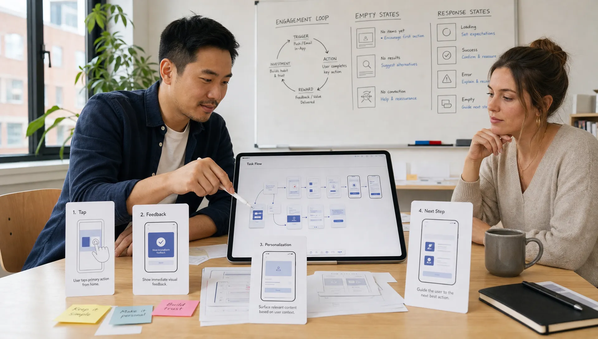
Interactive app development is not about adding animations, badges, chat widgets, or swipe gestures for their own sake. The goal is more practical: help users take meaningful action, get immediate feedback, and feel that the app responds intelligently to what they need next.
For funded startups, this matters because engagement is not a cosmetic metric. It affects activation, retention, monetization, reviews, and whether users trust the product enough to make it part of their routine. A beautifully built app can still fail if every session feels passive, confusing, slow, or disconnected from the user’s context.
The best interactive apps feel alive without feeling noisy. They guide without overwhelming. They respond instantly where it matters. They create a loop where each user action produces value, and that value encourages the next action.
What “interactive” really means in mobile app development
In mobile products, interactivity is the quality of the conversation between the user and the system. Every tap, scroll, drag, input, notification, loading state, error message, and confirmation contributes to that conversation.
A low-interaction app might technically function, but it leaves users wondering what happened, what to do next, or why they should return. A high-interaction app makes progress visible and emotionally satisfying. It gives users confidence that the product understands their intent.
Strong interactivity usually includes four elements:
- Input: The user can act quickly through taps, swipes, forms, voice, camera, location, or connected devices.
- Feedback: The app immediately confirms what changed, what is loading, or what needs attention.
- Adaptation: The experience changes based on user behavior, preferences, progress, or context.
- Progression: Each interaction moves the user toward a clear outcome, not just another screen.
This is why interactive app development sits at the intersection of product strategy, UX design, engineering, performance, analytics, and release operations. It is not one feature. It is a product discipline.
Start with the engagement loop, not the feature list
Many teams begin interactive app development by asking, “What interactive features should we add?” A better question is, “What user loop should this product create?”
An engagement loop is the repeatable sequence that makes the app valuable over time. For a fitness app, the loop might be set a goal, complete a workout, see progress, adjust the next session. For a marketplace, it might be search, compare, save, receive updates, purchase. For a collaboration app, it might be create, invite, respond, resolve.
If the loop is weak, more interactivity will not fix the product. It may even make the app feel busier. If the loop is strong, interactive moments can amplify motivation, clarity, and momentum.
Before designing screens, define:
- The key action you need users to take in their first session.
- The reward or value they receive after that action.
- The reason they come back within the next day, week, or month.
- The friction points that could interrupt the loop.
- The signals that show whether the loop is working.
This connects directly to retention-focused product design. If you are still shaping the foundation, Appzay’s guide to mobile app UI/UX principles that improve retention is a useful companion because it explains how user experience choices influence whether people keep using an app.
Design feedback that makes every action feel clear
Users should never have to wonder whether the app registered their action. A tap should produce a visible state change. A form submission should show progress. A saved item should look saved. A failed request should explain what happened and how to recover.
This is especially important on mobile, where network conditions change, screens are small, and users are often distracted. Interactive feedback reduces uncertainty and gives users a sense of control.
Good feedback can be subtle. It might be a button state, a loading skeleton, a progress indicator, a haptic cue, a success message, or a live preview. The key is timing. Feedback should arrive quickly enough that the user connects it to their action.
Nielsen Norman Group’s usability guidance on response times remains relevant here: users perceive very short delays differently from delays that interrupt flow. In practical mobile development, this means your design and engineering teams should decide which interactions must feel instant, which can show progress, and which need background processing.
Make onboarding interactive, but keep it useful
Onboarding is often the first place startups try to create engagement. Unfortunately, many onboarding flows become a wall of slides, permissions, and profile questions before the user has experienced any value.
Interactive onboarding works best when it helps users achieve something real. Instead of explaining the whole app, guide users through the first meaningful action. Let them personalize the experience only when the information improves the next step. Ask for permissions at the moment they are needed, not as a generic checklist at launch.
For example, a finance app might let users choose a goal and immediately show a sample plan. A wellness app might ask three questions and generate a first recommendation. A productivity app might help users create their first project instead of showing a tour of every feature.
The principle is simple: onboarding should not delay value. It should deliver value.
Use microinteractions to support behavior, not decorate screens
Microinteractions are small moments of feedback within the app, such as a toggle switching on, a card expanding, a pull-to-refresh animation, or a confirmation after a task is completed. They can make an app feel premium, but only when they support understanding.
The most effective microinteractions do one of three things:
- Confirm that an action was successful.
- Prevent a mistake before it happens.
- Make progress or status easier to understand.
A password field that shows strength as the user types is interactive because it improves the outcome. A checkout button that changes state during payment is interactive because it reduces anxiety. A progress animation after completing a lesson is interactive because it reinforces momentum.
Animation alone is not the same as interactivity. If motion slows the user down, hides important information, or competes with the main task, it hurts engagement rather than improving it. Apple’s Human Interface Guidelines and Google’s Material Design guidance both emphasize clarity, responsiveness, and platform consistency, which are essential for interaction design that feels native.
Personalization makes interaction feel relevant
Engagement improves when the app remembers users and adapts to them. Personalization can be as simple as restoring the last viewed item or as advanced as tailoring recommendations based on behavior. The right level depends on the product, data sensitivity, and user expectations.
For early-stage products, personalization does not need to be complex. A few thoughtful details can make the experience feel dramatically more interactive:
- Resume users exactly where they left off.
- Sort content based on recent behavior or stated goals.
- Show contextual next steps instead of generic menus.
- Let users control notification preferences early.
- Use saved preferences to reduce repeated input.
Personalization should always be transparent and useful. If the app adapts in ways users do not understand, it can feel intrusive. If it adapts in ways that clearly save time or increase relevance, it builds trust.
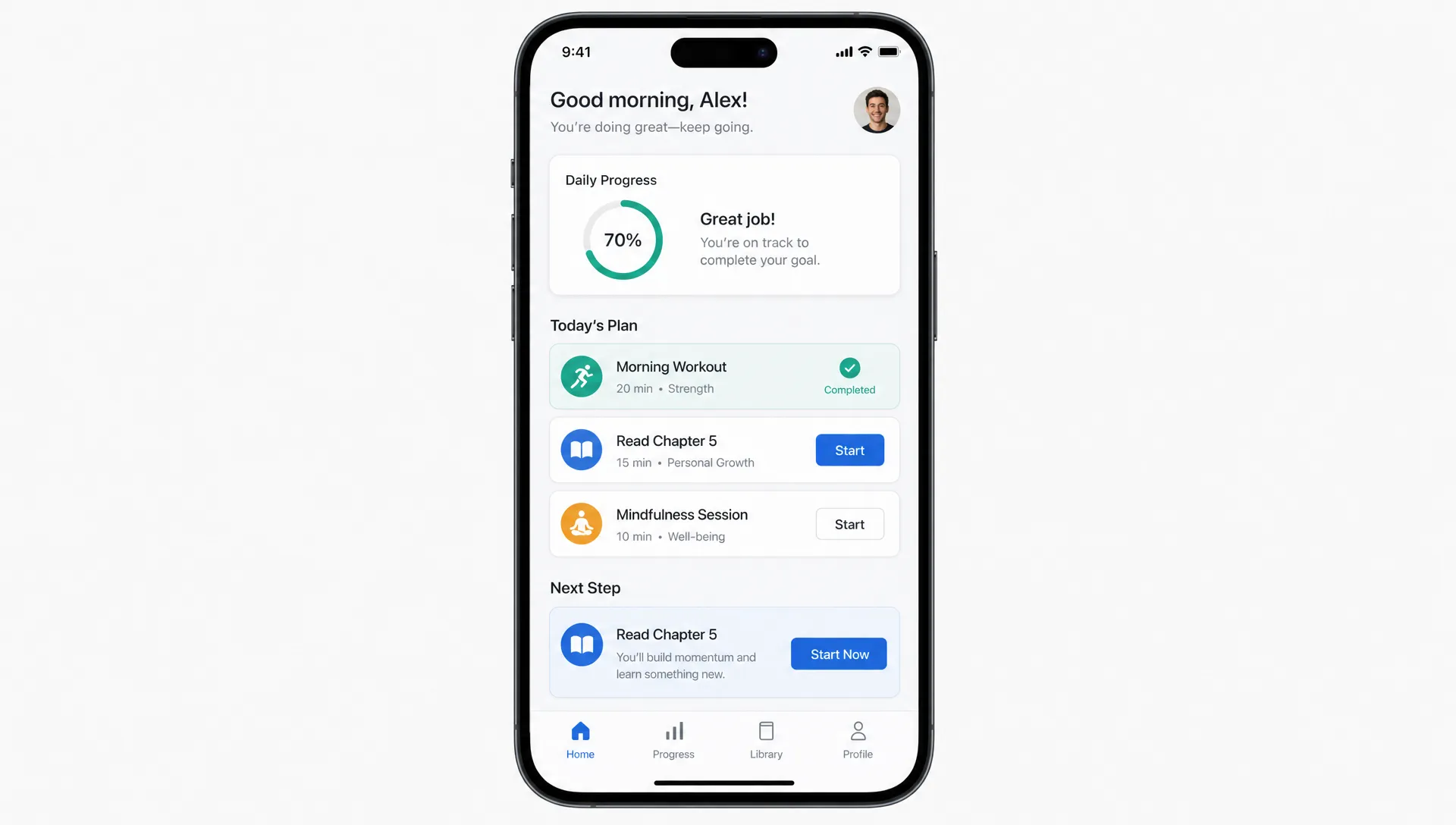
Build interactive flows around real user states
A common mistake is designing the “happy path” only. Real users encounter empty states, slow networks, partial data, expired sessions, invalid inputs, abandoned flows, and edge cases. These moments define whether an app feels reliable.
Interactive app development should account for the full range of user states:
| User state | What the app should do | Engagement benefit |
|---|---|---|
| First-time user | Guide one high-value action with minimal setup | Faster activation |
| Returning user | Resume context and show the next best step | Reduced friction |
| Empty state | Explain what is missing and invite a useful action | Prevents dead ends |
| Loading state | Show progress or useful placeholders | Reduces uncertainty |
| Error state | Explain the issue and offer recovery | Preserves trust |
| Power user | Support shortcuts, saved preferences, and advanced paths | Increases depth of use |
This is where clear user flows matter. Interactive moments should not be designed as isolated screen details. They should be mapped across the full journey so the experience remains coherent from entry point to outcome. For a deeper look at this planning process, see Appzay’s article on designing an app with clear user flows.
Performance is part of interactivity
An app cannot feel interactive if it feels slow. Users experience performance through touch: how fast the app opens, how quickly screens respond, whether scrolling stays smooth, and whether actions feel blocked by network calls.
This means interactive app development requires technical choices that protect responsiveness. Some of the most important include local caching, optimistic UI updates, efficient API design, background sync, image optimization, lazy loading, and careful management of animation and rendering.
For example, when a user likes a post, saves an item, or checks off a task, the app can often update the interface immediately and sync the change in the background. If the sync fails, the app can show a recoverable state. This pattern makes the app feel faster while still preserving data integrity.
Performance also affects battery usage. Heavy background work, inefficient location tracking, excessive network requests, or poorly optimized animations can make users abandon an app even if the core idea is strong. Google’s Android vitals documentation is a useful reference for understanding the technical signals that influence app quality on Android.
If speed and responsiveness are a concern, Appzay’s guide to mobile app performance optimization that users can feel breaks down the practical areas that most directly shape user perception.
Use notifications as interaction, not interruption
Push notifications, in-app messages, and email reminders can support engagement, but only when they are tied to user intent. A notification should help users complete something they care about, respond to something timely, or return to value they already asked for.
Weak notifications are generic: “Come back and check what’s new.” Strong notifications are contextual: “Your saved item is back in stock,” “Your report is ready,” or “Three teammates responded to your proposal.”
The difference is relevance. Notifications should extend the app’s interactive loop, not compensate for a weak one. Give users control over frequency and categories, and avoid asking for push permission before they understand why it matters.
Prototype interactions before you build them
Interactive features are expensive to reinterpret late in development. A static design can show layout, but it often fails to reveal timing, transitions, empty states, and decision points. This is why interactive prototyping is so valuable before full engineering begins.
A prototype helps founders, designers, developers, and stakeholders test whether the app feels intuitive before committing to production code. It can reveal whether users understand the next step, whether a gesture is discoverable, whether onboarding is too long, or whether an animation helps or distracts.
For funded startups, this reduces rework. It also improves investor, stakeholder, and early customer conversations because the product feels tangible earlier. The goal is not to prototype everything. The goal is to prototype the moments that carry the most product risk.
These usually include onboarding, the core engagement loop, primary conversion actions, permissions, personalized recommendations, and high-stakes states such as payment, booking, publishing, or data submission.
Measure engagement with behavior, not opinions
User feedback matters, but engagement must be measured through behavior. People may say they like a feature and still never use it. Others may complain about a flow but continue using it because it solves a real problem. Analytics help reveal the difference.
Useful engagement metrics depend on the app category, but most interactive apps should track a few fundamentals:
| Metric | What it reveals | Why it matters |
|---|---|---|
| Activation rate | Whether users reach first value | Shows if onboarding works |
| Feature adoption | Which interactions users actually use | Helps prioritize roadmap decisions |
| Session depth | How far users progress in a visit | Indicates value and flow quality |
| Retention cohorts | Whether users return over time | Measures lasting engagement |
| Drop-off points | Where users abandon key flows | Identifies friction and confusion |
| Response latency | How fast interactions feel | Connects engineering to UX quality |
The best teams pair analytics with qualitative research. Watch users interact with the product. Review support tickets. Study session recordings where appropriate and compliant. Talk to users who activated, users who churned, and users who never completed setup.
Interactivity should evolve based on evidence. If a feature is fun but does not support the core loop, it may not deserve more investment. If a small feedback improvement increases completion rates, it may be more valuable than a major new feature.
Common mistakes that reduce engagement
Interactive app development can go wrong when teams confuse activity with value. More gestures, more prompts, more animations, and more notifications do not automatically create a better app.
Watch for these pitfalls:
- Adding gamification without a meaningful user goal.
- Hiding core actions behind clever but undiscoverable gestures.
- Triggering notifications before users have formed intent.
- Making animations too slow for frequent tasks.
- Treating loading, empty, and error states as afterthoughts.
- Personalizing experiences without explaining why.
- Measuring clicks instead of meaningful progress.
The best interactive apps are not necessarily the busiest. They are the ones where users always understand what is happening, what they can do next, and why it is worth doing.
How Appzay approaches interactive app development
Building an interactive mobile app requires more than attractive screens. It requires a team that can connect product strategy, UX, native mobile engineering, backend architecture, release orchestration, and ongoing support.
Appzay partners with founders to take mobile products from concept to App Store, including strategy, UX design, iOS and Android engineering, cloud integration, CI/CD, launch support, app store optimization, and proactive maintenance. That end-to-end approach matters because engagement is shaped by every layer of the product, from the first prototype to the reliability of production releases.
When interactivity is planned early, tested before development, engineered for performance, and improved after launch, the result is not just an app that users try. It is an app they understand, trust, and come back to.
Frequently Asked Questions
What is interactive app development? Interactive app development is the process of designing and building mobile apps that respond clearly to user actions, adapt to user context, and guide users through meaningful engagement loops. It includes UX design, feedback states, personalization, performance, analytics, and scalable engineering.
Do interactive features always improve retention? Not always. Interactive features improve retention only when they support a real user goal. Animations, badges, gestures, or notifications can hurt retention if they add friction, distract users, or make the app harder to understand.
What are the most important interactive elements in a mobile app? The most important elements are fast feedback, clear onboarding, useful empty and error states, contextual next steps, responsive touch interactions, personalized content, and notifications that match user intent.
When should startups prototype interactive app experiences? Startups should prototype high-risk interactions before full development begins, especially onboarding, the core user loop, conversion flows, permissions, and any feature that depends on timing, gestures, personalization, or complex states.
How do you measure whether an app is engaging? Measure engagement through activation rate, retention cohorts, feature adoption, session depth, drop-off points, and interaction latency. These metrics should be combined with user interviews and usability testing to understand why users behave the way they do.
Turn your app idea into an experience users return to
If you are building a funded startup and want a mobile app that feels responsive, useful, and ready to scale, Appzay can help you move from concept to launch with a complete product and engineering team behind you.
Explore how Appzay builds premium iOS and Android apps that combine product strategy, UX design, native engineering, cloud architecture, release orchestration, and long-term support.