6/11/2026
Mobile App UI UX Principles That Improve Retention
Learn mobile app UI UX principles that improve retention, from onboarding and core loops to trust, speed, notifications, and metrics.
Downloads are encouraging, but retention is what proves your mobile product is becoming a habit. A polished interface can help win the first session, but strong mobile app UI UX is what gets users to come back, complete the core action again, and trust the product enough to keep it installed.
For funded startups, retention is not just a design metric. It affects runway, CAC payback, investor confidence, App Store reviews, and the speed at which your team learns from real users. The challenge is that retention rarely improves because of one beautiful screen. It improves when the product experience makes the user’s next successful action obvious, fast, and worth repeating.
Why mobile app UI UX directly affects retention
Retention is the outcome of repeated value. Users return when the app helps them accomplish something meaningful with less effort than the alternatives. UI is the visible layer, but UX includes the flow, timing, speed, feedback, permissions, empty states, notifications, and recovery paths that shape the full experience.
A retention-focused product team should ask a different question than a purely visual design team. Instead of asking whether the app looks modern, ask whether the app makes the user’s next high-value action easier every time they open it.
This matters most in the first few sessions. If users do not understand the product, reach value quickly, or feel confident that the app works reliably, they will not wait for future improvements. They will leave, uninstall, or silently churn.
| Retention driver | UI UX question to answer | Practical design implication |
|---|---|---|
| Activation | Can new users reach a meaningful outcome quickly? | Reduce onboarding steps and guide users to the first win. |
| Repeat use | Is there a clear reason to come back? | Design a visible core loop, not disconnected features. |
| Trust | Does the app feel safe, predictable, and transparent? | Explain permissions, data usage, payments, and account actions clearly. |
| Speed | Does the app feel responsive under real conditions? | Optimize core screens, use loading states, and avoid blocking flows. |
| Recovery | Can users continue after errors, empty states, or weak networks? | Design every state, not just the happy path. |
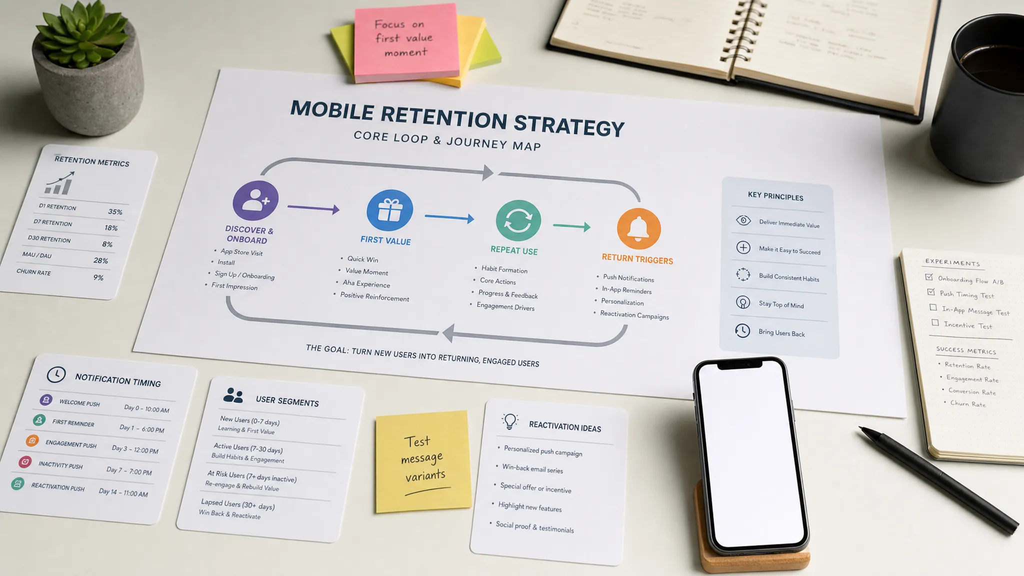
Principle 1: Design the core retention loop before the screens
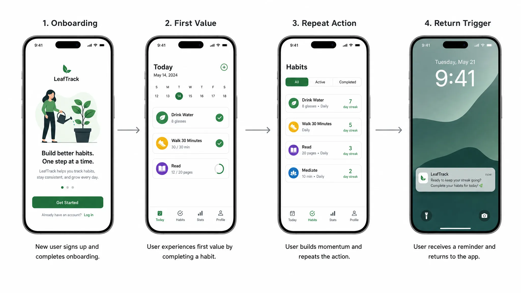
The most important mobile app UI UX principle is to design around the core loop, not around a feature list. A core loop is the repeatable sequence that delivers value and gives users a reason to return.
For a fitness app, the loop may be open app, view today’s plan, complete workout, see progress, return tomorrow. For a mobile CRM app, it may be capture meeting notes, sync to the CRM, review follow-ups, act on reminders. For a delivery app, it may be place order, track status, receive delivery, reorder later.
If the core loop is unclear, retention suffers because the user does not know what the app is for after the first session. This is why early UX work should map the primary user journey before visual design begins. A screen map is useful, but a loop map is more valuable because it forces the team to define the action that must happen repeatedly.
A strong retention loop usually has four parts: a trigger, a fast action, a visible outcome, and a next reason to return. The UI should make each part obvious. If users need to search for the primary action, interpret vague labels, or remember where they left off, the loop is too fragile.
For teams still shaping their MVP, Appzay’s guide on how to design an app with clear user flows is a useful companion to this step.
Principle 2: Make the first session prove value
The first session is not the time to explain every feature. It is the time to prove that the app can solve the user’s problem. Retention often improves when onboarding becomes shorter, more contextual, and closer to the user’s first meaningful action.
Many teams overload onboarding because they want users to understand the whole product. The better approach is progressive onboarding. Teach only what the user needs to complete the next step, then introduce deeper functionality when it becomes relevant.
A retention-focused first session should answer these questions:
- What is the user trying to accomplish right now?
- What is the smallest action that creates a visible win?
- Which setup steps can be delayed until after value is shown?
- Which permissions are truly needed before the first action?
- What should the user see immediately after completing the first action?
This is especially important for apps that require account creation, data import, payments, location, contacts, Bluetooth, or notifications. Asking for everything upfront may simplify engineering, but it often hurts trust and completion rates. A better UX earns each request by showing why it matters at the right moment.
Principle 3: Reduce cognitive load in frequent flows
Users may tolerate complexity once, but they rarely tolerate it repeatedly. The flows that drive retention should become faster and easier over time. If a user repeats an action weekly, daily, or multiple times per day, the design should remove friction aggressively.
Reducing cognitive load does not mean removing all choices. It means making the next best choice clear. Strong mobile interfaces use hierarchy, defaults, familiar controls, and concise copy to help users act without overthinking.
In high-frequency flows, prioritize one primary action per screen. Secondary actions should be available but visually quieter. Use defaults when the app can reasonably infer user intent. Keep labels specific. Replace generic buttons like Continue with action-based labels such as Save note, Start route, or Confirm booking.
Mobile context also matters. People use apps while walking, commuting, switching networks, standing in line, or multitasking. Thumb reach, tap target size, readable typography, and simple navigation are not cosmetic details. They influence whether the product feels effortless enough to reuse.
Principle 4: Respect platform conventions without losing product identity
Retention improves when an app feels familiar enough to use immediately. Users bring expectations from iOS and Android into every new product. When navigation, gestures, permissions, inputs, and system components behave as expected, users spend less energy learning the interface and more energy receiving value.
This does not mean every app should look generic. Brand expression still matters, especially for premium consumer and B2B products. The key is to differentiate through content, motion, tone, visual system, and product moments while preserving familiar interaction patterns.
For example, date selection, biometric authentication, back behavior, notification settings, tab bars, bottom sheets, and error handling should align with platform norms. If the app fights the operating system, it creates subtle friction that accumulates over time.
This principle also affects technology choices. Cross-platform frameworks can produce excellent experiences, but only when the team pays close attention to native behavior, performance, and platform-specific details. If you are deciding between native and cross-platform implementation, Appzay’s comparison of native app vs React Native can help frame the trade-offs.
Principle 5: Design for real-world states, not only the happy path
Many retention problems appear outside the ideal demo flow. A user opens the app with no data yet. A payment fails. GPS permission is denied. The API times out. A sync is still pending. The account is restricted. A notification leads to a screen that no longer exists.
If these states are not designed, users experience confusion instead of confidence. They may assume the app is broken even when the system is working as intended.
| State | Retention risk | Better UI UX behavior |
|---|---|---|
| Empty state | User does not know what to do first. | Explain the value of the screen and offer one clear next action. |
| Loading state | User thinks the app is frozen. | Use skeleton screens, progress indicators, or partial content when possible. |
| Error state | User hits a dead end. | Explain what happened, offer recovery, and preserve user input. |
| Offline state | User cannot complete the task. | Show what still works and sync automatically when connection returns. |
| Permission denied | User loses access to a key feature. | Explain the impact and provide a route to settings or an alternative flow. |
| Sync pending | User is unsure whether data was saved. | Show status clearly and avoid duplicate actions. |
Designing these states early also reduces development ambiguity. Engineers should not have to invent UX decisions during implementation. If your team is preparing developer-ready flows, the Appzay guide on app screens planning and wireframes covers how to document these variants before development begins.
Principle 6: Make speed visible, not just measurable
Performance has a direct impact on retention because mobile users interpret slowness as unreliability. Even when a backend process takes time for valid reasons, the UI must communicate progress and preserve confidence.
There are two types of speed to design for: actual speed and perceived speed. Actual speed comes from engineering work such as optimizing cold start, reducing main-thread blocking, improving API response times, caching intelligently, and controlling asset size. Perceived speed comes from UX patterns that make waiting feel shorter or less uncertain.
Useful perceived-speed patterns include skeleton loading, optimistic updates, local drafts, background sync, prefetching, and inline progress indicators. The goal is not to fake speed. The goal is to make system behavior understandable while engineering improves the underlying performance.
The best retention flows should be tested on real devices, real networks, and realistic data volumes. A flow that feels instant on a simulator can feel sluggish on an older device over a weak connection. For more depth on this topic, see Appzay’s guide to app optimization for speed, battery, and retention.
Principle 7: Build trust into every sensitive moment
Trust is a retention feature. Users return to apps that handle their data, payments, identity, and permissions responsibly. They abandon apps that feel vague, intrusive, or unpredictable.
Trust-sensitive moments include account creation, sign-in, payment, subscription cancellation, permission prompts, AI-generated output, data export, deletion, location tracking, and third-party integrations. Each moment should explain what is happening in plain language and give users enough control to feel safe.
For startups operating in regulated, enterprise, government, or data-sensitive markets, retention can also depend on deeper infrastructure choices. Data governance, cloud strategy, and technological sovereignty shape whether customers trust the product long term. Teams exploring those concerns can learn from digital sovereignty and data governance specialists who focus on open, secure, and resilient technology foundations.
From a mobile UX perspective, trust should appear in small details. Use clear permission rationale screens. Make privacy settings easy to find. Confirm destructive actions. Show sync and save status. Avoid dark patterns in subscriptions or cancellations. If users feel tricked once, they may not come back.
Principle 8: Treat notifications as part of the product, not a marketing channel
Push notifications can support retention, but only when they are useful, timely, and controllable. Poorly timed notifications train users to disable alerts or uninstall the app.
The best notifications are tied to user intent or meaningful events. A delivery status update, meeting reminder, price alert, safety notification, habit prompt, or collaboration update can bring users back because it helps them complete a task. Generic promotional blasts rarely build durable retention.
Permission timing matters. Instead of asking for notification permission during the first few seconds, wait until the user has experienced a moment where notifications clearly add value. Then explain the benefit in product-specific language.
Notification settings should also be granular. Let users choose what they receive, how often, and through which channels when relevant. Retention is stronger when users feel in control of their relationship with the app.
Principle 9: Make accessibility a retention advantage
Accessibility is often discussed as compliance, but it is also a retention principle. If users cannot read, tap, navigate, hear, understand, or control your app comfortably, they are less likely to keep using it.
Accessible design benefits more than users with permanent disabilities. It helps people using the app in sunlight, with one hand, while tired, with a cracked screen, in noisy environments, on older devices, or under time pressure.
Practical accessibility choices include sufficient color contrast, scalable typography, clear focus states, meaningful screen reader labels, large tap targets, captions for audio or video content, reduced-motion support, and forms that explain errors clearly. These details make the app feel more professional and more forgiving.
Accessibility should be part of design QA and engineering acceptance criteria, not an afterthought before launch. Retrofitting accessibility after the interface is built usually costs more and produces worse results.
Principle 10: Connect UI UX decisions to retention metrics
Retention-focused design needs measurement. Without instrumentation, teams end up debating opinions instead of learning from behavior. The goal is not to track everything. The goal is to track the moments that reveal whether users understand, trust, and repeat the core flow.
| Metric | What it reveals | Example UX question |
|---|---|---|
| Activation rate | Whether users reach first value. | Where do new users drop before the first meaningful outcome? |
| Time to first value | How quickly the app proves usefulness. | Can setup or onboarding be shortened? |
| Core action repeat rate | Whether users build a habit. | Do users return to perform the primary action again? |
| Funnel completion | Where friction appears in key flows. | Which screen or state causes abandonment? |
| Permission opt-in rate | Whether users trust the request. | Is the permission prompt timed and explained well? |
| Notification engagement | Whether alerts are useful. | Which notifications bring users back without causing opt-outs? |
| Crash-free sessions | Whether the app feels reliable. | Are technical failures damaging retention cohorts? |
| Support contact rate | Whether the UX is self-explanatory. | Which flows create confusion or anxiety? |
These metrics should be reviewed by product, design, and engineering together. If activation is weak, the fix may be UX simplification. If repeat use is weak, the product loop may need work. If retention drops after a release, performance or reliability may be the cause. UI UX and engineering quality are inseparable in real mobile products.
For launch teams, it is also worth connecting retention instrumentation to release practices. Appzay’s mobile app launch checklist explains how to prepare rollout, monitoring, and post-launch iteration so the team can respond quickly after users arrive.
A retention-focused UI UX checklist for your next build
Use this checklist during discovery, design review, and pre-launch QA. It is intentionally practical because retention problems usually come from small unresolved decisions that accumulate.
- The app has one clearly defined core retention loop.
- New users can reach first value without unnecessary setup.
- Each high-frequency screen has one obvious primary action.
- Onboarding teaches only what the user needs at that moment.
- Permission requests are contextual and clearly explained.
- Empty, loading, error, offline, and sync states are designed.
- Navigation follows iOS and Android expectations where it matters.
- Critical flows are tested on real devices and weak networks.
- Notifications are event-based, useful, and user-controlled.
- Accessibility is included in design and QA acceptance criteria.
- Analytics measure activation, repeat use, drop-off, and reliability.
- Post-launch feedback has a clear owner and iteration plan.
If several of these items are missing, a visual refresh alone is unlikely to improve retention. The product needs a flow-level review that connects user intent, interface behavior, technical performance, and measurable outcomes.
Frequently Asked Questions
What is mobile app UI UX? Mobile app UI UX refers to both the interface users see and the full experience they have while using an app. UI includes layout, typography, buttons, icons, and visual hierarchy. UX includes onboarding, navigation, permissions, performance, feedback, error handling, trust, and the overall path to value.
How does UI UX improve app retention? UI UX improves retention by helping users reach value faster, repeat important actions with less effort, recover from problems, and trust the product. Retention usually improves when the core user loop becomes clearer, faster, and more reliable.
Which UI UX change has the biggest retention impact? The highest-impact change is often simplifying the path to first value. If new users can complete a meaningful action in the first session, they are more likely to return. After that, improving repeat flows, performance, and notifications usually has strong leverage.
Should startups redesign the whole app to improve retention? Not always. Many retention issues can be improved with targeted flow changes, better onboarding, clearer empty states, improved permission timing, or faster core screens. A full redesign makes sense when the product structure itself is confusing or the current design cannot support the core loop.
When should UI UX be planned in the app development process? UI UX should be planned before engineering begins, then refined during development and after launch. Early planning reduces rework, while post-launch analytics and user feedback show where the experience needs improvement.
Build a mobile app users keep coming back to
Retention is not created by attractive screens alone. It comes from a product experience that helps users succeed quickly, repeat the core action easily, and trust the app every time they open it.
Appzay helps funded startups design, build, launch, and improve premium iOS and Android apps end to end. From product strategy and UX design to native engineering, cloud integration, release orchestration, App Store optimization, and ongoing support, our team works with founders to turn strong ideas into scalable mobile products.
If you are planning a new app or improving an existing one, talk to Appzay about building a retention-focused mobile experience from concept to App Store launch.